2011

2010

2009

2008

The blog is dead, long live the blog !

11 August 2011

Hello everyone,

The blog is dead...

This is the last post I'll do on this particular blog.


exitthekingbig.jpg After some year using Dotclear as a blog engine, I decided to move to Wordpress because of its larger community and its awesome amount of plugins.

More over, my URL with the dash (blog.lexique-du-net.com" is quite difficult to remember especially as it is in French.

Finally my friend, LG Morand, can't stop himself harassing me about my blog colors' choice (green and orange are fine for me !).

Long live the blog !


My new blog is at this adress : http://www.jonathanantoine.com !


836.JPG Quite easy to remember and no more dashes !

The same subjects will be adressed on it: WPF, Silverlight, Windows Phone 7, XAML, etc.

The RSS feed is still the same, no need to update it thanks to Yahoo pipes.

This blog will be keeped here but no more articles will be posted on it.

As an addition, you can also use this adress (but why :-s ?): lexiquedunet.com, lexiquedunet.fr, jonathanantoine.fr


Have a nice day !


MANGO live tile: use a picture in the IsolatedStorage as a background for your tile

3 August 2011

One on the nice feature coming with WP7's mango is "live tiles". You can create tiles directly from your application and update them from a background agent.

Here is the sample which creates a "secondary tile" for your application:

//This is a .Net class named StandardTileData
var theTile= new StandardTileData
{
Title = "Secondary Tile", //The title
BackgroundImage = new Uri("FrontImage.jpg", UriKind.Relative),
Count = 12, //Notification number
BackTitle = "Back's page title", //The title of the back page
BackContent = "A text is nice here",
BackBackgroundImage = new Uri("backImage.jpg", UriKind.Relative)
};
// Add the live tile to the Home screen (will exit the app)
ShellTile.Create(new Uri("/MainPage.xaml", UriKind.Relative), theTile);

Now, you may want to generate a screenshot of your application (using WriteableBitmap) and use it as the tile background. This is possible !

To do so, you have to store the picture in a folder named "Shared/ShellContent" otherwise you will have an NotSupportedException throwned.

The URI to use will then look like this one : "isostore:/Shared/ShellContent/background.png". You can read this MSDN page for more information.

It takes me some minutes and Wilfried to figure this out, I hope this will save you this time !
 

Amazing WPF Controls / JetPack Theme updated !

13 June 2011

Hello,

I have updated my previously introduced control library on codeplex. I received a lot of comments because the jetPack theme was not working fine bacause of some animation.

It is now fixed and I want to thank everyone for the feedback !__

Here are the list of the available updates:

  • JetPack Theme is now building and working fine at design time and runtime,
  • The brushes are now freezed for better performance,
  • The showcase code is easier to read and refactored,


For those wondering how I solved the issues here is the explanation. Instead of providing directly the value to the DiscreteObjectKeyFrame which seems to mislead it in the conversion to the correct type, I provide the aimed object.

<!--This code-->
<DiscreteObjectKeyFrame KeyTime="0" Value="*" />
 
<!--Is replaced by this one :--> 
<DiscreteObjectKeyFrame KeyTime="0">
   <DiscreteObjectKeyFrame.Value>
      <GridLength>*</GridLength>
   </DiscreteObjectKeyFrame.Value>
</DiscreteObjectKeyFrame>


If you find another issue, mail me ! My email adress is on this page or you can contact me through twitter...

Shout it kick it on DotNetKicks.com


[UPDATED] How to call the method from the base of the base of the current class ? (base.base.MyMethod)

11 May 2011

Today I encountered a tricky need in some custom control. It was inheriting from the TabControl but I didn’t want all its feature. Especially I didn’t want it to update the SelectedContent dependency property because it was keeping a strong reference to a ViewModel and keeping it away from the garbage collector.

Continue reading...


What ? Dynamic resources creates Memory leaks in WPF 3.5 (SP1) ???

27 March 2011

Everyone is told to not use DynamicResource during its childhood in WPF-(wonder)land. They are simply evil and they kill the app performance. Sometimes, we fall in the dark side of the force and use them effectively to be sure that the application will follow the trend and suits itself well. This is not as bad as it seems and it is in fact sometimes necessary and wanted.

 But today, while I was trying to improve the performance and the memory usage of a WPF application I work on, I discovered that they were also creating memory leaks! I felt betrayed. I was using them and they put a knife in my back while I trusted them to be useful. 


In this post we will see how it can happens, and how to solve this (little) issue.

Continue reading...


UIAutomation, Coded UI tests, AutomationPeer and WPF/silverlight custom controls

24 March 2011

The Coded UI Tests, available in Visual Studio Ultimate or Premium, enable the creation of automated tests for the User Interface. This is a really nice feature because you are no more forced to make "hand made" tests which takes hours to be performed. 

The WPF controls in the framework are ready to be used by the Microsoft UI Automation which is itself used by the coded UI tests. This means that when you use the screen recorder to record the tests on your UI, it will be able to find the several control used in your application.

When you create you own custom controls or extend standard one, the recorder would not be able to find them at first and so a whole part of the screen may not be available for tests. Actually, it is possible to record a test but every steps will be done using screen position: click at (120,30), drag from (120,30) to (10,40). This is really annoying because any changes in the UI may broke all your tests.


In this post, we will see how to make a custom control fully useable in Coded UI tests scenarii. We will so answer the question "Why cannot the code UI test recorder find anything inside my WPF or Silverlight custom control ?"


Note: the same technique is used by the accessibility clients and by enabling this feature you also ease the people using your application through UI automation client like the partially-sighted person.

Continue reading...


[Announcement] : Live Meeting in French about WPF 4.0 and Multitouch.

16 January 2011

For those who are interested by WPF and Multitouch : I will animate a LiveMeeting on this subject tuesday 18 january in french.

You can subscribe to it on this page.

I hope to see you there.


News, news and news !

1 January 2011

First of all, I wish and happy new year to everyone !


It started very nice for me because I received and email from Microsoft telling me that I had been given an MVP award for 2011! I am very honored to receive it and I hope I will prove I deserve it this year !


MVPLogo_ColorDear Jonathan ANTOINE,


Congratulations! We are pleased to present you with the 2011 Microsoft® MVP Award! This award is given to exceptional technical community leaders who actively share their high quality, real world expertise with others. We appreciate your outstanding contributions in Client App Dev communities during the past year.

So thank you Microsoft and all the people who helped and still helps me doing it !


Second thing is that I didn’t write a lot of posts since November because I am currently working on one another great community project with a friend which is eating all my time. Be sure that You will know about it as soon as it is finished … Smile !


Finally, I will give a session during the french TechDays with Aurélien NORIE. It will – of course – be about multitouch with WPF 4.0. More information about it can be read here : http://goo.gl/PZHWC


Happy new year again !


[RIA Services] Why the client extended entities won't use the default backing store value ? EDITED

19 November 2010

The title may not be clear but I am talking about the entities that you extends on the client side using the fact that they are partial class. You may think as I was that if you add properties in them with backing store field, the properties will get initialed nicely : this is not the case and the property will always use the default value for the property type.


In this post we’ll discover how to perform our goal : create a property with the correct default value.


Take for example a Task entity in which you want to add a property IsVisible to tells the View if it should display it or not. By default, the Task should be visible. You will end up with this resulting code :

public partial class Task
{
//Default framework value for boolean is Falsek
private bool _isVisible = true;
public bool IsVisible
{
get
{
return _isVisible;
}
set
{
_isVisible = value;
}
}
}


But it won’t work and every loaded entity will have the IsVisible property to the default value which is Fase. Notice that I used the “loaded” verb and not “create” because the entity created use the correct value.


So why is it not working ?

In fact this is quite easy : when you load the entities, they are not created the usual way but de-serialized from the stream sended by the server so since the property is only on the client side, it wont be initialized with your value but with the default one. When you create entities, like the whole object is present on the client side and no de-serialisation is done, it will work as usual.


But RIA Services do not let us alone, the best practice is to initialize the default value of this kind in an override of the OnLoaded method. The final and working code should then be(take care to read the edit below after):

public partial class Task
{
protected override void OnLoaded(bool isInitialLoad)
{
base.OnLoaded(isInitialLoad);
IsVisible = true;
}
//Default framework value for boolean is Falsek
private bool _isVisible = true;
public bool IsVisible
{
get
{
return _isVisible;
}
set
{
_isVisible = value;
}
}
}


Hope this will save you the time to investigate I spend on this…


EDIT: In fact the entities are reloaded each time you submit changes and there is currently a bug (which will be fixed in the SP1  - as pointed out by Jeff in the comments) which will reset the value of your property to the default value even if it has been changed since.. But I have found a quite easy work around, by using two differents variables and knowing that RIA will simply ignore internal properties :

public partial class Task
{
protected override void OnLoaded(bool isInitialLoad)
{
base.OnLoaded(isInitialLoad);
//only for the initial load
if (isInitialLoad)
{
IsVisibleFix = true;
}
}
//Default framework value for boolean is Falsek
private bool _isVisible = true;
public bool _isVisible
{
//NO setter so RIA can't update the value
get { return _isVisible; }
}
//Internal so RIA ignore it and don't set the value
internal bool IsVisibleFix {
set { _isVisible = value; RaisePropertyChanged("DeleteVisibility"); }
}
}


You can read more on this forum post too : http://forums.silverlight.net/forums/t/203750.aspx


Shout itkick it on DotNetKicks.com


VS Tip : how to locate the active document in the solution explorer using a shortcut

4 November 2010

When you have multiple projects in your solution, you often want to locate the active document in the solution explorer. There is a great option in Visual Studio which can do it for you all the time : “View.TrackActivityInSolutionExplorer”.


But if you do not want (as me) to turn it on all the time, there is no specific option or shortcut. So I have created a little macro which make my life easier. It simply turn on then off the option resulting by centering the active document in the solution explorer.


Here is the macro ( I put the Alt-T shorcut on it) :

Imports System
Imports EnvDTE
Imports EnvDTE80
Imports EnvDTE90
Public Module Utilities
Public Sub TrackProjectItem()
DTE.ExecuteCommand("View.TrackActivityInSolutionExplorer")
End Sub
End Module


Shout it kick it on DotNetKicks.com


Introducing the amazing WPF controls library on Codeplex !

25 October 2010

Hello everyone,


I am pleased to announce you the creation of the Amazing WPF controls library on Codeplex !

It will contains the differents controls I describe and/or peel on this blog. I will try to make an article for each control added to the library.


Here is a list of the currently available controls :


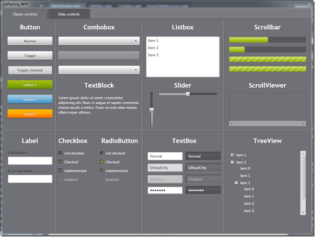
I also added to it the JetPack theme ported to WPF.


I hope you enjoy it !


http://amazingwpfcontrols.codeplex.com/


Shout it kick it on DotNetKicks.com


How to create an hand writing to text control (ink recognizer)

When building a (multi)touch application you may need one nice feature : translate hand-written text to real words. This open a whole new world full of possibilities like starting some actions when keywords are recognized or simply allow the users to write some text for later use. 

In this post we'll see all the step to create an hand writing to text control and how to tune it.

Continue reading...


[RIA Services] How to force the validation of my entities (and just the validation !)

19 October 2010

RIA services solves for you a lot of problems and one of them is to add validations rules on the entities both on the client and on the server side. These differents rules are checked when you submit the changes from the client to the server or when you call “EndEdit” on the entities.


But there is times when you want to leverage the validation without submit the changes or commit your object modification (in a IEditableObject way of talking). In this post we will discover how to do just this.


Why don’t just call EndEdit() by the way ? Because by doing so you may push entities which are in a wrong state into the domain context with no way to revert to a correct state. Indeed, although the EndEdit method of the RIA entities launch the validation process and update the validations errors it does not stop the EndEdit from being performed even if there is errors.

So it may be a better idea to check if the Entity is in a correct state (no validation errors) before to call the EndEdit.


The little snippet to use is very simple and straightforward and it works well with the Silverlight toolkit dataform (if needed). It use the Validator class from the same assembly in which are the differents validations sttributes : System.ComponentModel.DataAnnotations.


/// <summary>
/// Validates the item and add its error in its validationErrors list.
/// </summary>
/// <param name="dataToValidate">The data to validate.</param>
/// <returns><code>True</code> if the object is valid, false otherwise.</returns>
public static bool ValidateItem(Entity dataToValidate, 
      out ICollection<ValidationResult> validationResults)
{
  if (dataToValidate == null) 
     throw new ArgumentNullException("dataToValidate");
 
  validationResults = new List<ValidationResult>();
  ValidationContext context = new ValidationContext(dataToValidate, null, null);
  Validator.TryValidateObject(dataToValidate, context, validationResults, true);
  dataToValidate.ValidationErrors.Clear();
  foreach (var res in validationResults)
  {
      dataToValidate.ValidationErrors.Add(res);
  }
  return validationResults.Count == 0;
}


Do you know any other way to perform this ?


Shout it kick it on DotNetKicks.com


Migrate the Jetpack theme from Silverlight to WPF

14 October 2010

There is a great theme named Jetpack available for Silverlight applications which can be found on the Tim Heuer web site. I was wondering if it can be used in WPF applications and the answer is yes ! Here are the modifications I had to do to make all this work :


  • SelectionBackground replace by SelectionBrush (except for the DatePicker)
  • I removed the HyperlinkButton which does not exist in WPF
    DataGridFrozenGrid is not existing in WPF : I replaced it by a GRID
  • No navigation system : Frame style removed,
  • No page : replaced by HeaderedContentControl
  • DescriptionViewer : not available in WPF and removed,
  • TabNavigation replaced by : KeyboardNavigation.ControlTabNavigation
  • ValidationSummary does not exist in WPF : I removed it,
  • No Watermark in WPF: I removed it
  • ContentPresenter does not support direct content :  Ireplaced it by ContentControl,
  • AutoCompleteBox : not available in WPF and removed,
  • DataPager : not available in WPF and removed,
  • ChildWindow : not available in WPF and removed,
  • I removed the style targeting the textblock because it was imposing itself anywhere especially in the listboxitem leadind to wong behaviours,
  • I replace the differents name by their WPF PART_XXX counterparts
  • PasswordBox :  Ireplaced the ContentElement border by a ScrollViews named PART_ContentHost
  • I Replaced the animations key <DiscreteObjectKeyFrame KeyTime="0" Value=”Visible" /> by <DiscreteObjectKeyFrame KeyTime="0" Value="{x:Static Visibility.Visible}" />
  • Rewrite entirely the scrollbar style so it works nicely...
  • Rewrite entirely the Slider style so it works nicely...
  • Rewrite a fex the TabItem/Tab control style so it works nicely...


JetpackingWPF


So far, here is a list of the translated control’s theming :

  • TextBox,
  • ListBox,
  • Combobox,
  • PasswordBox,
  • ProgressBar,
  • Button,
  • ToggleButton,
  • RadioButton
  • Checkbox,
  • Scrollbar,
  • ScrollViewer,
  • Slider,
  • TreeView,
  • TabControl,
  • Label


So far, here is a list of the NOT TESTED and may not working element

  • Datagrid,
  • DatePicker,
  • Grid Splitter,
  • Expander,
  • ContextMenu.


PS: the demo application is in the post attachment…


I am currently working on it to add more working them components.


Edit (16/10/2010, 01:28) : I added new controls themes(Scrollbar, ScrollViewer, Slider, TreeView, TabControl, Label) and a new demo applications.


 Shout it kick it on DotNetKicks.com


How to create your own control library (how-to + tips)

3 October 2010

Reusability and factorizing are maybe the most commons things you want and use when you are developing applications. In WPF it often means creating controls library (i don’t mean UserControl) that will be easy to use in multiple applications.


In this post we'll see all the step to create a control library useable in differents projects.

The example to illustrate the theory will be to create an headered control.


PS: note that it already exists in the framework under the nice name of GroupBox.

Creating a control library

Foundation of the project

The first step is to use the VS2010 Wizard named "WPF Custom control library" to create the library which will contain the controls. We will name it, by excess of modesty : “AmazingsWPFControls” !


As you can see, VS has created some files and directory for us :
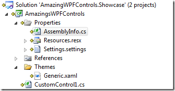
project tree


Let’s take them one by one ! The “Themes\generic.xaml” file is where the WPF engine, when it loads your control, looks for it’s theme aka. a style setting a template. Here is its content :

<Style TargetType="{x:Type local:CustomControl1}">
    <Setter Property="Template">
        <Setter.Value>
            <ControlTemplate TargetType="{x:Type local:CustomControl1}">
                <Border Background="{TemplateBinding Background}"
 BorderBrush="{TemplateBinding BorderBrush}"
                        BorderThickness="{TemplateBinding BorderThickness}">
                </Border>
            </ControlTemplate>
        </Setter.Value>
    </Setter>
</Style>


The “AssemblyInfo.cs” file which contains a specific attribute :" ThemeInfo”. It tells the framework where to look for the theme files. Usually it is used like this :

[assembly: ThemeInfo( ResourceDictionaryLocation.None,

//where theme specific resource dictionaries are located //(used if a resource is not found in the page, // or application resource dictionaries) ResourceDictionaryLocation.SourceAssembly

//where the generic resource dictionary is located //(used if a resource is not found in the page, // app, or any theme specific resource dictionaries) )]


The “CustomControl1.cs” which is an empty custom control the wizard created for you(how kind of him). Its content is interesting because it show you that you have to override the MetaData of the newly created control to force the WPF engine using the style defined in the generic.xaml file.

public class CustomControl1 : Control
{
static CustomControl1()
{
DefaultStyleKeyProperty.OverrideMetadata(typeof(CustomControl1),
new FrameworkPropertyMetadata(typeof(CustomControl1)));
}
}


Each time you want to add a new custom control to the library, you will have to reproduce each of these steps. Of course, the wizard to add a new Custom Control can do it for you but its always a good thing to know how it works. In our case we’ve to rename CustomControl1 to HeaderedControl.


Here we are with the foundation of the library. Now we are going to add a template and behaviors to the control.


Choose the more appropriated base class

By default the wizard make the control a inherit from the Control class but there are differents options that you may consider for base class :

  • Control : This is a base class which lets you the most freedom but the most to do !
  • ContentControl : This is a good choice if the control will be used to represent a single piece of content.
  • HeaderedContentControl : This is a good choice to represent a single element with an header.
  • ItemsControl: This is a good choice if the control will be used to represent a list of items.


In our case the best choice should be to inherit from HeaderedContentControl  but we will prefer the ContentControl for demonstration purpose. Note that it meets the specifications: we will represent a single element with an header.


Adding a Template and some behaviors to the control

Setting the template of the control

Unlike UserControl there is no code-behind and you set the template of the control by creating a style in the generic.xaml file. This also means that it’s not possible to access the elements via their names because the control and its representation are linked together only at runtime. But don’t worry, you can still access the differents parts following the steps described in this post.


One of the best practice is to name the revelants parts of your control prefixed with “PART”. By revelants parts, I mean the elements which together build the behavior of your control : for example the track of the slider control is named “PART_Track”. This best practice make your control re-templatable by designer which will know that the controls prefixed by “PART_” are mandatory in the new template they are building. Finally, the parts are declared in the control class via an attribute “TemplatePart” defining the name and the aimed type of control. So in our example, we’ll add a part named “PART_Header which will be the header :


/// <summary>
/// A control displaying an header at the top of its content.
/// </summary>    
[TemplatePart(Name = "PART_Header", Type = typeof(Border))]
public class HeaderedControl : Control
{
  // ...
}


Adding a content to the control

To add and display a content two things are needed : a property containing the content and a place in the template to display it. The content can be of any type of your choice and is usually placed in the Content property for ContentControl and the Items property for ItemsControl. This is the default behavior but you can override it and tell which property is the content by using the ContentPropertyAttribute on the control’s class :

[ContentPropertyAttribute("Content")] public class HeaderedControl : ContentControl { // ... }


Then, in the template, you define where the content is displayed using a ContentPresenter that you can place where you wants depending of the need. We also use a TemplateBinding to bind the content of the class to the ContentPresenter. In our case we add the content under the header :

<Style TargetType="{x:Type local:HeaderedControl}">
   <Setter Property="Template">
       <Setter.Value>
           <ControlTemplate TargetType="{x:Type local:HeaderedControl}">
               <DockPanel>
                   <Border x:Name="PART_Header" DockPanel.Dock="Top" Background="{TemplateBinding Background}"
                           BorderBrush="{TemplateBinding BorderBrush}"
                           BorderThickness="{TemplateBinding BorderThickness}" />
                   <ContentPresenter Content="{TemplateBinding Content}" />
               </DockPanel>
           </ControlTemplate>
       </Setter.Value>
   </Setter>
</Style>


Adding a bindable property to the control

Adding a property to your control is quite useful if you want to permit some customization of its behavior. This is something very common that you use often without noticing it : every attribute you set in the XAML is simply a property of the controls you use.


In our case there is a lot which are already here because of our inheritance of FrameworkElement. But let’s said that we want to add another one all we have to do is do declare a new dependency property and its accessor as in the code behind. In our case we add two property : the header (of type Object) and the position of the header in the control. So we have this class :

public class HeaderedControl : ContentControl
{
  static HeaderedControl()
  {
      DefaultStyleKeyProperty.OverrideMetadata(typeof(HeaderedControl),
          new FrameworkPropertyMetadata(typeof(HeaderedControl)));
  }
 
  #region Header
 
  /// <summary>
  /// Header Dependency Property
  /// </summary>
  public static readonly DependencyProperty HeaderProperty =
      DependencyProperty.Register("Header", typeof(object), typeof(HeaderedControl),
          new FrameworkPropertyMetadata((object)null));
 
  /// <summary>
  /// Gets or sets the Header property. This dependency property 
  /// indicates the header to display.
  /// </summary>
  public object Header
  {
      get { return (object)GetValue(HeaderProperty); }
      set { SetValue(HeaderProperty, value); }
  }
 
  #endregion
 
  #region HeaderPosition
 
  /// <summary>
  /// HeaderPosition Dependency Property
  /// </summary>
  public static readonly DependencyProperty HeaderPositionProperty =
      DependencyProperty.Register("HeaderPosition", typeof(HeaderPosition), typeof(HeaderedControl),
          new FrameworkPropertyMetadata(HeaderPosition.Top));
 
  /// <summary>
  /// Gets or sets the HeaderPosition property. This dependency property 
  /// indicates ....
  /// </summary>
  public HeaderPosition HeaderPosition
  {
      get { return (HeaderPosition)GetValue(HeaderPositionProperty); }
      set { SetValue(HeaderPositionProperty, value); }
  }
 
  #endregion
 
 
  /// <summary>
  /// Defines where to place the header
  /// </summary>
  public enum HeaderPosition : int
  {
      /// <summary>
      /// The header is positioned on the left.
      /// </summary>
      Left = 0,
 
      /// <summary>
      /// The header is positioned at the top.
      /// </summary>
      Top = 1,
 
      /// <summary>
      ///  The header is positioned on the right.
      /// </summary>
      Right = 2,
 
      /// <summary>
      ///  The header is positioned at the bottom.
      /// </summary>
      Bottom = 3,
 
  }
}
 

Now let’s use these properties in the template to show and place the header at the right position. We will add another content presenter to display the header and we’ll use a converter to convert the header position into the correct DockPanel.Dock value (only the revelant XAML is showed) :

<ControlTemplate TargetType="{x:Type local:HeaderedControl}">
  <Border Background="{TemplateBinding Background}" 
          BorderBrush="{TemplateBinding BorderBrush}"
          BorderThickness="{TemplateBinding BorderThickness}">
      <DockPanel>
          <Border x:Name="PART_Header" 
              DockPanel.Dock="{Binding PositionOfTheHeader,
              RelativeSource={RelativeSource Mode=TemplatedParent},
              Converter={conv:HeaderPositionToDockPositionConverter}}">
              <ContentPresenter Content="{TemplateBinding Header}" />
          </Border>
          <ContentPresenter Content="{TemplateBinding Content}" />
      </DockPanel>
  </Border>
</ControlTemplate>
Adding a custom command to the control

Adding a command to our control is not as straightforward as I thought before to try Smile but here is the guideline is used to make it work fine :

  1. Create the RoutedCommand of your choice in the control class,
  2. Create a private method which will be called when the command is executed,
  3. Register a Class Command binding of this command in the static constructor of the control (you can think of it as a static command binding which will be called each time the command is executed),
  4. In the handler of the class command binding gets the sender of the command, cast it to your class and call the private method you created just before.


In our case there no really need of a command but lets say that we will add a command which sets the position of the header property to the “Top” value we will results with this code (against only the revelant part):

static HeaderedControl()
{
DefaultStyleKeyProperty.OverrideMetadata(typeof(HeaderedControl),
   new FrameworkPropertyMetadata(typeof(HeaderedControl)));
 
//Instanciate the command
MoveHeaderToTopCommand = new RoutedUICommand("MoveHeaderToTop",
   "MoveHeaderToTop", typeof(HeaderedControl));
 
//Create the command binding
CommandBinding moveHeaderToTopCommandBinding =
   new CommandBinding(MoveHeaderToTopCommand, 
                  MoveHeaderToTopCommand_Executed,
                  MoveHeaderToTopCommand_CanExecute);
 
CommandManager.
   RegisterClassCommandBinding(typeof(HeaderedControl), 
                     moveHeaderToTopCommandBinding);
}
 
 
static void MoveHeaderToTopCommand_Executed(
        object sender, ExecutedRoutedEventArgs e)
{
    HeaderedControl headeredControl = 
                 sender as HeaderedControl;
    if (headeredControl != null)
       headeredControl.moveHeaderToTop();
}
 
static void MoveHeaderToTopCommand_CanExecute(object sender, 
       CanExecuteRoutedEventArgs e)
{
e.CanExecute = true;
}
 
private void moveHeaderToTop()
{
this.PositionOfTheHeader = HeaderPosition.Top;
}
 

The command is then useable as any other WPF command in your application and you can even use parameters if needed.


Adding a Routed event to the control

Adding an event can be useful to notify the others part of your application that an action occurred in the control or to deliver informations.


To add an event here are the guideline :

  1. (optionnal) Creates the events args inherithing from RoutedEventArgs that you will use
  2. Declare the event handler of the event,
  3. Declare the RoutedEvent with the name of your choice,
  4. Creates the accesor for a simplier use,
  5. (optionnal) creates a raiseYourEvent method to raise the event easily.


Now lets assume we wants to raise an event when the header is clicked. For this we’ll subscribe to the Header “MouseDown” event in the OnApplyTemplate() method and raise a newly created event in its handler :

public override void OnApplyTemplate()
{
   base.OnApplyTemplate();
 
   PART_Header = this.GetTemplateChild("PART_Header") as Border;
   if (PART_Header == null)
       throw new ArgumentNullException(
           "Can't find PART_Header in the HeaderedControl template.");
   PART_Header.MouseDown += (a, b) => { RaiseHeaderClickedEvent(); };
}
 
 
/// <summary>
/// the event handler delegate
/// </summary>
public delegate void HeaderClickedEventHandler(object sender, 
    HeaderClickedEventArgs e);
 
/// <summary>
/// Create a custom routed event by first 
/// registering a RoutedEventID
/// This event uses the bubbling routing strategy
/// </summary>
public static readonly RoutedEvent HeaderClickedEvent = 
    EventManager.RegisterRoutedEvent(
   "HeaderClicked", RoutingStrategy.Bubble, 
   typeof(HeaderClickedEventHandler), typeof(HeaderedControl));
 
/// <summary>
/// Occurs when the header is clicked.
/// </summary>
public event RoutedEventHandler HeaderClicked
{
   add { AddHandler(HeaderClickedEvent, value); }
   remove { RemoveHandler(HeaderClickedEvent, value); }
}
 
/// <summary>
/// Raises the header clicked event.
/// </summary>
void RaiseHeaderClickedEvent()
{
   HeaderClickedEventArgs newEventArgs = 
    new HeaderClickedEventArgs(
            HeaderedControl.HeaderClickedEvent);
   RaiseEvent(newEventArgs);
}
 
/// <summary>
/// The header has been clicked event args
/// </summary>
public class HeaderClickedEventArgs : RoutedEventArgs
{
   /// <summary>
   /// Initializes a new instance of the
   /// <see cref="HeaderClickedEventArgs"/> class.
   /// </summary>
   /// <param name="routedEvent">The routed event.</param>
   public HeaderClickedEventArgs(RoutedEvent routedEvent) 
     : base(routedEvent) { }
}


Ease the use of your library by declaring an URL as an XML namespace


What is it ? Simply that when you will use the controls in another page you will not declare the XML namespace via an assembly name but via an URL easy to remember. Example :

<Window x:Class="AmazingWPFControls.Showcase.MainWindow"
 xmlns="http://schemas.microsoft.com/winfx/2006/xaml/presentation" 
 xmlns:controls="http://blog.lexique-du-net.com/wpf/AmazingsWPFControls"
/>


Why to do it ?

So now all you have to do is to create a bright new control Smile

Interesting links


Shout it kick it on DotNetKicks.com


WPF tip : How can I use static/dynamic resources in my tests

24 September 2010

You are surely, as I am, creating a lot of units tests in your WPF applications.

Some of the tests may use statics or dynamics resources declared in your application and when you launch the tests, all you get is an XamlParseException exception thrown.

System.Windows.Markup.XamlParseException: 'Provide value on 'System.Windows.StaticResourceExtension' threw an exception.' Line number '11' and line position '83'.
---> System.Exception: Cannot find resource named 'myStaticResource'. Resource names are case sensitive.


The tip to make them work is quite simple to use. What is actually happening ? : the created control is looking for the resource via the classic russian puppets system and does not find the application because the tests does not create it. And the application is exactly where you have declared the needed ressources. So all we've got to do is to create the application and initialize it before running the tests.

Also we called the InitializeComponent() methods to make sure the application is initialized. It seems that this last part is only necessary if the resources are from the same assembly than the application.

So just add this method to your tests classes :

/// <summary>
///Use ClassInitialize to run code before running the first test in the class
/// </summary>
/// <param name="testContext">The test context.</param>
[ClassInitialize()]
public static void MyClassInitialize(TestContext testContext)
{
  //Create the application for resources.
  if (System.Windows.Application.Current == null)
  {
    App application = new App();
    application.InitializeComponent();
  }
}


The App.xaml content is below:

<Application x:Class="MyAssembly.App" xmlns="http://schemas.microsoft.com/winfx/2006/xaml/presentation"
    xmlns:x="http://schemas.microsoft.com/winfx/2006/xaml"
    xmlns:myLib="clr-namespace:MyAssembly.ViewModels"
	StartupUri="Views\MainWindow.xaml">
 
  <Application.Resources>
    <ResourceDictionary>
      <myLib:ViewModelLocator x:Key="myStaticResource" />
    </ResourceDictionary>
 
  </Application.Resources>
</Application>

Here we are !


Shout it kick it on DotNetKicks.com
 

Quick tip : My WPF Fullscreen window still display a border on right and bottom side... how to remove them

23 September 2010

Creating a fullscreen window in WPF is quite simple, you just have to set WindowState to Maximized and WindowStyle to None.

But in my current project I was facing a little drawback : a border was still visible on the bottom and on the right side of my window :

Example of broken border

I have seen some solution on the web talking about Win32 interop and WM_GETMINMAXINFO messages, butit is quite simplier : just set the ResizeMode attribute of your Window to ''NoResize''. You will then end up with this windows :

<Window x:Class="lexiqueDuNet.com.Window1" 
        xmlns="http://schemas.microsoft.com/winfx/2006/xaml/presentation"
        xmlns:x="http://schemas.microsoft.com/winfx/2006/xaml" 
       WindowState="Maximized" WindowStyle="None"  ResizeMode="NoResize" >
</Window>


Shout it kick it on DotNetKicks.com


How to create an animated expander

21 September 2010

The expander control can be used in a lot of situations but the one proposed by default is quite "rigid".

In this post we will discover how to animate it quite simply just via XAML !

The WPF engine lets us redefine the template of the controls and we'll just do that.

The goal aimed

What we aim is to get the same functionnality as the original expander.
This is not as simple as we tought and I've seen a lot of expander loosing some of their behaviors when they became "animated" : original value of IsExpanded ignored, ExpandDirection ignored, etc...

Getting the necessary files

The files needed are :

  1. the original control template of the Expander
  2. the expander's button style which are linked to it


To get them, I used Expression Blend folowing the MSDN steps on this page : http://msdn.microsoft.com/en-us/library/cc294908.aspx

Especially for you, they are also linked to the post :) !. Here is the expander original template :

<ControlTemplate TargetType="{x:Type Expander}">
  <Border SnapsToDevicePixels="true" 
      Background="{TemplateBinding Background}" 
      BorderBrush="{TemplateBinding BorderBrush}" 
      BorderThickness="{TemplateBinding BorderThickness}" 
      CornerRadius="3">
    <DockPanel>
      <ToggleButton FocusVisualStyle="{StaticResource ExpanderHeaderFocusVisual}" 
              Margin="1" 
              MinHeight="0" 
              MinWidth="0" 
              x:Name="HeaderSite" 
              Style="{StaticResource ExpanderDownHeaderStyle}" />
      <ContentPresenter Focusable="false" 
                Visibility="Collapsed" 
                HorizontalAlignment="{TemplateBinding HorizontalContentAlignment}" 
                Margin="{TemplateBinding Padding}" 
                x:Name="ExpandSite"   />
    </DockPanel>
  </Border>
  <ControlTemplate.Triggers>
    <Trigger Property="IsExpanded" Value="true">
      <Setter Property="Visibility" TargetName="ExpandSite" Value="Visible"/>
    </Trigger>
    <Trigger Property="ExpandDirection" Value="Right">
      <Setter Property="DockPanel.Dock" TargetName="ExpandSite" Value="Right"/>
      <Setter Property="DockPanel.Dock" TargetName="HeaderSite" Value="Left"/>
      <Setter Property="Style" TargetName="HeaderSite" 
                     Value="{StaticResource ExpanderRightHeaderStyle}"/>
    </Trigger>
    <Trigger Property="ExpandDirection" Value="Up">
      <Setter Property="DockPanel.Dock" TargetName="ExpandSite" Value="Top"/>
      <Setter Property="DockPanel.Dock" TargetName="HeaderSite" Value="Bottom"/>
      <Setter Property="Style" TargetName="HeaderSite" 
                    Value="{StaticResource ExpanderUpHeaderStyle}"/>
    </Trigger>
    <Trigger Property="ExpandDirection" Value="Left">
      <Setter Property="DockPanel.Dock" TargetName="ExpandSite" Value="Left"/>
      <Setter Property="DockPanel.Dock" TargetName="HeaderSite" Value="Right"/>
      <Setter Property="Style" TargetName="HeaderSite" 
                    Value="{StaticResource ExpanderLeftHeaderStyle}"/>
    </Trigger>
    <Trigger Property="IsEnabled" Value="false">
      <Setter Property="Foreground" 
               Value="{DynamicResource {x:Static SystemColors.GrayTextBrushKey}}"/>
    </Trigger>
  </ControlTemplate.Triggers>
</ControlTemplate>


Add the new behavior to the expander

As you can see, the original template plays on the Visibility property to expand or collapse the "expandable" part.

We will change that and add a scaling transformation on the "expendable part" of the control that we'll animate at the right moment (when the IsExpanded property value change).
Also we'll not use simple DataTrigger but MultiTrigger because we have to starts differents animation depending of the Expand direction.

The result is a quite simple but lenghty XAML file (the AnimatedExpanderStyles is linked to the post) :

<Style x:Key="ourAnimatedExpanderStyle" TargetType="{x:Type Expander}">
<Setter Property="Foreground"
             Value="{DynamicResource {x:Static SystemColors.ControlTextBrushKey}}" />
<Setter Property="Background" Value="Transparent" />
<Setter Property="HorizontalContentAlignment" Value="Stretch" />
<Setter Property="VerticalContentAlignment" Value="Stretch" />
<Setter Property="BorderBrush" Value="Transparent" />
<Setter Property="BorderThickness" Value="1" />
<Setter Property="Template">
  <Setter.Value>
    <ControlTemplate TargetType="{x:Type Expander}">
 
      <ControlTemplate.Resources>
        <ResourceDictionary>
          <ResourceDictionary.MergedDictionaries>
            <ResourceDictionary
     Source="/My.Assembly;component/AnimatedExpander/AnimatedExpanderStyles.xaml" />
        </ResourceDictionary.MergedDictionaries>
          <Storyboard x:Key="scaleYUp">
            <DoubleAnimation From="0" To="1" Duration="0:0:0.25" 
Storyboard.TargetName="ExpandSite"
Storyboard.TargetProperty="(FrameworkElement.LayoutTransform).(ScaleTransform.ScaleY)" />
          </Storyboard>
          <Storyboard x:Key="scaleYDown">
            <DoubleAnimation Fr  om="1" To="0" Duration="0:0:0.25" 
Storyboard.TargetName="ExpandSite"
Storyboard.TargetProperty="(FrameworkElement.LayoutTransform).(ScaleTransform.ScaleY)" />
          </Storyboard>
          <Storyboard x:Key="scaleXUp">
            <DoubleAnimation From="0" To="1" Duration="0:0:0.25"
Storyboard.TargetName="ExpandSite"
Storyboard.TargetProperty="(FrameworkElement.LayoutTransform).(ScaleTransform.ScaleX)" />
          </Storyboard>
          <Storyboard x:Key="scaleXDown">
            <DoubleAnimation From="1" To="0" Duration="0:0:0.25"  
Storyboard.TargetName="ExpandSite"
Storyboard.TargetProperty="(FrameworkElement.LayoutTransform).(ScaleTransform.ScaleX)" />
          </Storyboard>
        </ResourceDictionary>
      </ControlTemplate.Resources>
 
      <Border BorderBrush="{TemplateBinding BorderBrush}"
          BorderThickness="{TemplateBinding BorderThickness}"
          Background="{TemplateBinding Background}" CornerRadius="3"
                SnapsToDevicePixels="true">
        <DockPanel>
          <ToggleButton
              IsChecked="{Binding Path=IsExpanded, Mode=TwoWay, 
                                    RelativeSource={RelativeSource TemplatedParent}}"
              Margin="1" MinHeight="0" MinWidth="0" x:Name="HeaderSite"
              Style="{StaticResource ExpanderDownHeaderStyle}">
            <ContentPresenter Content="{TemplateBinding Header}"
                ContentTemplate="{TemplateBinding HeaderTemplate}"
                ContentTemplateSelector="{TemplateBinding HeaderTemplateSelector}" Margin="1"
                Focusable="false" />
          </ToggleButton>
 
          <ContentPresenter x:Name="ExpandSite"
              HorizontalAlignment="{TemplateBinding HorizontalContentAlignment}"
              VerticalAlignment="{TemplateBinding VerticalContentAlignment}"
              Margin="{TemplateBinding Padding}" Focusable="false">
            <ContentPresenter.LayoutTransform>
              <ScaleTransform x:Name="scaleTransform" ScaleX="1" ScaleY="1" />
            </ContentPresenter.LayoutTransform>
          </ContentPresenter>
        </DockPanel>
      </Border>
      <ControlTemplate.Triggers>
        <MultiTrigger>
          <MultiTrigger.Conditions>
            <Condition Property="IsExpanded" Value="True" />
            <Condition Property="ExpandDirection" Value="Up" />
          </MultiTrigger.Conditions>
          <MultiTrigger.EnterActions>
            <BeginStoryboard Storyboard="{StaticResource scaleYUp}" />
          </MultiTrigger.EnterActions>
          <MultiTrigger.ExitActions>
            <BeginStoryboard Storyboard="{StaticResource scaleYDown}" />
          </MultiTrigger.ExitActions>
        </MultiTrigger>
 
        <MultiTrigger>
          <MultiTrigger.Conditions>
            <Condition Property="IsExpanded" Value="True" />
            <Condition Property="ExpandDirection" Value="Down" />
          </MultiTrigger.Conditions>
          <MultiTrigger.EnterActions>
            <BeginStoryboard Storyboard="{StaticResource scaleYUp}" />
          </MultiTrigger.EnterActions>
          <MultiTrigger.ExitActions>
            <BeginStoryboard Storyboard="{StaticResource scaleYDown}" />
          </MultiTrigger.ExitActions>
        </MultiTrigger>
 
        <MultiTrigger>
          <MultiTrigger.Conditions>
            <Condition Property="IsExpanded" Value="True" />
            <Condition Property="ExpandDirection" Value="Left" />
          </MultiTrigger.Conditions>
          <MultiTrigger.EnterActions>
            <BeginStoryboard Storyboard="{StaticResource scaleXUp}" />
          </MultiTrigger.EnterActions>
          <MultiTrigger.ExitActions>
            <BeginStoryboard Storyboard="{StaticResource scaleXDown}" />
          </MultiTrigger.ExitActions>
        </MultiTrigger>
        <MultiTrigger>
          <MultiTrigger.Conditions>
            <Condition Property="IsExpanded" Value="True" />
            <Condition Property="ExpandDirection" Value="Right" />
          </MultiTrigger.Conditions>
          <MultiTrigger.EnterActions>
            <BeginStoryboard Storyboard="{StaticResource scaleXUp}" />
          </MultiTrigger.EnterActions>
          <MultiTrigger.ExitActions>
            <BeginStoryboard Storyboard="{StaticResource scaleXDown}" />
          </MultiTrigger.ExitActions>
        </MultiTrigger>
 
        <Trigger Property="ExpandDirection" Value="Down">
          <Setter Property="DockPanel.Dock" TargetName="ExpandSite" Value="Bottom" />
          <Setter Property="DockPanel.Dock" TargetName="HeaderSite" Value="Top" />
 
        </Trigger>
        <Trigger Property="ExpandDirection" Value="Up">
          <Setter Property="DockPanel.Dock" TargetName="ExpandSite" Value="Top" />
          <Setter Property="DockPanel.Dock" TargetName="HeaderSite" Value="Bottom" />
          <Setter Property="Style" TargetName="HeaderSite"
              Value="{DynamicResource ExpanderUpHeaderStyle}" />
 
        </Trigger>
        <Trigger Property="ExpandDirection" Value="Right">
          <Setter Property="DockPanel.Dock" TargetName="ExpandSite" Value="Right" />
          <Setter Property="DockPanel.Dock" TargetName="HeaderSite" Value="Left" />
          <Setter Property="Style" TargetName="HeaderSite"
              Value="{DynamicResource ExpanderRightHeaderStyle}" />
 
        </Trigger>
 
        <Trigger Property="ExpandDirection" Value="Left">
          <Setter Property="DockPanel.Dock" TargetName="ExpandSite" Value="Left" />
          <Setter Property="DockPanel.Dock" TargetName="HeaderSite" Value="Right" />
          <Setter Property="Style" TargetName="HeaderSite"
              Value="{DynamicResource ExpanderLeftHeaderStyle}" />
        </Trigger>
 
      </ControlTemplate.Triggers>
    </ControlTemplate>
  </Setter.Value>
</Setter>
</Style>

Conclusion

To use this Expander we have to use this little snippet :

<Expander Header="Our text" ExpandDirection="Up" 
               Style="{StaticResource ourAnimatedExpanderStyle}"    >
    <!--- content here ! --->
</Expander>


Everythings seems to works fine and all the behaviors of the original expander are still here !

Shout it kick it on DotNetKicks.com


UserControl/Control : how to get a reference to an element of the template

14 September 2010

When you want to create your own custom control you have two choices : create an UserControl or inherit from one of the "Control's classes" (ContentControl, ItemsControls or Control itself). When doing so, you'll surely need to access to the visual parts of your template from the code to add to it a nice behavior.

In this post, we'll discover how to access the template children by using the FindName method even on UserControl.

You create a control

I won't explain you how to create a custom control, so here is its base code :

[TemplatePart(Name = "PART_MyGrid", Type = typeof(Grid))]
  public class MyCustomControl : ContentControl
  {
    private Grid myAimedGrid;
 
    static MyCustomControl()
    {
	  //Overrides the style by ours
      DefaultStyleKeyProperty.OverrideMetadata(typeof(MyCustomControl),
          new FrameworkPropertyMetadata(typeof(MyCustomControl)));
    }
  }


And here is how we define its template for the generic visual theme in the "Themes\generic.xaml" file. Notice that we add a named Grid :"PART_MyGrid". We'll seek for it later from the code.

<ResourceDictionary xmlns="http://schemas.microsoft.com/winfx/2006/xaml/presentation"
    xmlns:x="http://schemas.microsoft.com/winfx/2006/xaml"
    xmlns:local="clr-namespace:FindNamesApplication.MyContentControl">
  <Style TargetType="{x:Type local:MyCustomControl}">
    <Setter Property="Template">
      <Setter.Value>
        <ControlTemplate TargetType="{x:Type local:MyCustomControl }">
          <Grid x:Name="PART_MyGrid" Background="Black" Width="{TemplateBinding Width}"
              Height="{TemplateBinding Height}">
            <ContentPresenter Content="{TemplateBinding Content}" />
          </Grid>
        </ControlTemplate>
      </Setter.Value>
    </Setter>
  </Style>
</ResourceDictionary>


Now how can we find the grid from the code behind ? Simply by accessing the template at the right moment : when the template is applied.
To do so we will override the OnApplyTemplate() method and access directly to the grid by its name with the FindName method. We can then act on it as we wish.

public override void OnApplyTemplate()
{
  //Effectively apply the template
  base.OnApplyTemplate();
 
  //Find the grid in the template once it's applied
  myAimedGrid = base.Template.FindName("PART_MyGrid", this) as Grid;
 
  //We can subscribe to its events
  myAimedGrid.PreviewMouseDown += 
     new MouseButtonEventHandler(myAimedGrid_PreviewMouseDown);
}
 
void myAimedGrid_PreviewMouseDown(object sender,
 System.Windows.Input.MouseButtonEventArgs e)
{
  //Proof 
  MessageBox.Show("Mouse preview Down on the grid !");
}


By the way, when you create a custom control which is focused on reusability you should imperatively declare its differents parts by using the TemplatePart attribute :

[TemplatePart(Name="PART_MyGrid",Type=typeof(Grid))]
public class CustomControl : ContentControl
{
// ....
}


You create an user control

Now the hardest part of the post : you create an user control as a reusable part of your application. To do so you create the C# file and the XAML file and as you want it to be customized, you set it's ContentTemplate as below :

/// <summary>
/// Interaction logic for MyCustomUserControl.xaml
/// </summary>
public partial class MyCustomUserControl : UserControl
{
  private Grid myAimedGrid;
 
  public MyCustomUserControl()
  {
    InitializeComponent();
  }
}

The XAML file :

<UserControl x:Class="FindNamesApplication.MyUserControl.MyCustomUserControl"
        xmlns="http://schemas.microsoft.com/winfx/2006/xaml/presentation"
        xmlns:x="http://schemas.microsoft.com/winfx/2006/xaml"
        xmlns:mc="http://schemas.openxmlformats.org/markup-compatibility/2006"
        xmlns:d="http://schemas.microsoft.com/expression/blend/2008" mc:Ignorable="d" d:DesignHeight="300"
        d:DesignWidth="300">
    <UserControl.ContentTemplate>
        <DataTemplate>
            <Grid x:Name="PART_MyGrid" Background="Black" Width="{TemplateBinding Width}"
                    Height="{TemplateBinding Height}">
                <ContentPresenter Content="{TemplateBinding Content}" />
            </Grid>
        </DataTemplate>
    </UserControl.ContentTemplate>
</UserControl>


Then, as you have seen before you override the OnApplyTemplate and get the child with the FindName methods : this won't do the job ! Actually, all you will get is 'null' or an InvalidOperationException sometimes.

Why ? Because by setting the controlTemplate, you define a DataTemplate which is then used by our UserControl to be applied on it's internal ContentPresenter. So by using findName on the UserControl we search the element named "PART_MyGrid" in the template of the UserControl and not in the template created by us and actually used.

So the solution is to seek the element on the correct element which is the ContentPresenter of the template of the UserControl. To do so we'll find it using the VisualTreeHelper to get the ContentPresenter and then use the FindName method with it as a parameter. Here is the code :

public override void OnApplyTemplate()
{
  base.OnApplyTemplate();
 
  //The ContentPresenter is the second child of the UserControl...
  ContentPresenter presenter = (ContentPresenter)
    (VisualTreeHelper.GetChild(VisualTreeHelper.GetChild(this, 0), 0));
 
  //Be sure that the template is applied on the presenter
  presenter.ApplyTemplate();
 
  //get the grid from the presenter
  myAimedGrid =
    presenter.ContentTemplate.FindName("PART_MyGrid", presenter) as Grid;
 
  //We can subscribe to its events
  myAimedGrid.PreviewMouseDown
    += new MouseButtonEventHandler(myAimedGrid_PreviewMouseDown);
}
 
void myAimedGrid_PreviewMouseDown(object sender, MouseButtonEventArgs e)
{
  //Proof 
  MessageBox.Show("Mouse preview Down on the grid !");
}


Interesting links

Here are some links to go further on the subject :


Conclusion

As we can see, nothing is impossible and once seen, it's quite easy to implement these differents solutions... Have a great code ! The source solution is linked to the post.

Shout it kick it on DotNetKicks.com


.NET Framework 4, Windows Applications Development

24 June 2010

I am now certified " .NET Framework 4, Windows Applications Development".

I passed the certification during the beta process and the results are out. I can now use this nice logo anywhere ^^ :

MCTS_rgb__1369_1098.jpg


- page 1 of 4